by [email protected] | Feb 6, 2026 | Graphic Design, Trending
In today’s competitive marketplace, a product’s success often begins long before the first purchase — it starts with the first impression. Packaging is no longer just a container; it is a silent ambassador of the brand. Our latest tea label design project is a perfect example of how thoughtful design can transform packaging into a powerful storytelling medium.
The Power of First Impressions
When a customer encounters a product, the label is the first conversation they have with the brand. It communicates identity, quality, and emotion in seconds. For this tea label, our goal was clear: to capture the essence of Ceylon heritage while delivering a modern, premium visual experience.
We focused on creating a design that instantly evokes freshness, origin, and authenticity — elements deeply connected to Sri Lanka’s rich tea culture.
Blending Heritage with Modern Branding
Great label design lives at the intersection of tradition and innovation. The visual narrative we crafted reflects:
-
The misty highlands where Ceylon tea is grown
-
Warm sunrise tones symbolizing freshness and beginnings
-
Elegant typography that conveys premium quality
-
Balanced color harmony that attracts attention without overwhelming
Every element was intentionally chosen to create a cohesive story — one that feels authentic, refined, and memorable.
Design as a Storytelling Tool
A label should do more than inform — it should invite engagement. This design was built to trigger curiosity and emotional connection. When customers see the packaging, they don’t just see tea; they experience a visual journey to its origin.
This storytelling approach strengthens brand recognition and elevates perceived value, helping the product stand out on crowded shelves.
Attention to Detail Matters
Exceptional packaging design is driven by precision. From typography spacing to color psychology, every detail influences how a product is perceived. Our creative process ensures that:
-
Visual hierarchy guides the viewer’s eye
-
Colors align with brand emotion and positioning
-
Typography enhances readability and elegance
-
Artwork complements product identity
These details work together to create a label that feels premium and purposeful.
Beyond Packaging — Building Brand Identity
At Graphics.lk, we believe packaging is a strategic branding asset. A well-crafted label not only attracts attention but builds trust, communicates professionalism, and reinforces brand identity.
This project demonstrates how design can elevate a product from functional to iconic — turning packaging into an unforgettable brand experience.
Final Thoughts
A great label is not decoration — it is communication, emotion, and identity wrapped into a visual form. When design goes beyond the product, it becomes a story customers remember.
And that is the true power of creative packaging.
by [email protected] | Feb 2, 2026 | Graphic Design
Luxury Logo Design in Sri Lanka: Creating Timeless Food Brand Identities
In today’s competitive market, a brand’s identity is more than just a logo, it is the first impression, the emotional connection, and the foundation of trust.
At Graphics.lk, we specialize in luxury logo design in Sri Lanka, helping brands stand out through clean, timeless, and premium aesthetics.
The Power of Minimal & Elegant Logo Design
For premium food and lifestyle brands, design should never feel loud or overcrowded.
Instead, it must feel
-
Simple
-
Balanced
-
Sophisticated
-
Memorable
A well-crafted logo communicates quality even before the customer tastes the product.
Minimal branding is especially powerful for:
-
Gourmet food products
-
Organic labels
-
Luxury packaging
-
Premium export brands
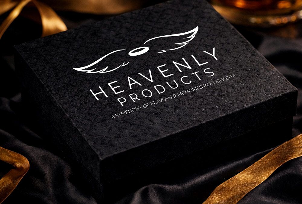
Case Study: Heavenly Products – A Premium Food Brand Identity
Our latest logo design project for Heavenly Products reflects elegance and refinement through:
The identity was created to suit multiple product categories such as:
This flexibility ensures the brand remains consistent across every touchpoint.
Why Food Brands in Sri Lanka Need Premium Branding
Sri Lanka’s food industry is growing rapidly, especially in:
-
Export markets
-
Organic product lines
-
Boutique gourmet brands
-
Luxury retail shelves
To compete globally, brands require more than just a product — they need an identity that feels world-class.
That’s why investing in professional logo design services in Sri Lanka is essential.
What Makes a Logo Feel Premium?
A luxury logo is not about complexity — it’s about intention.
At Graphics.lk, we focus on:
Timeless design principles
Modern minimalism
High-end brand positioning
Label-ready scalability
Premium typography and balance
Every detail is crafted to make the brand feel elevated.
Looking for Logo Design in Sri Lanka?
Whether you’re launching a new product or upgrading your brand identity, we help you create visuals that feel premium, intentional, and unforgettable.
Based in Sri Lanka
Serving local & international brands
Specialists in luxury food branding & identity design
Let’s Create Something Beautiful.
If you’re searching for:
-
Logo design Sri Lanka
-
Premium brand identity design
-
Luxury packaging and label branding
-
Minimal logo designers in Sri Lanka
Graphics.lk is ready to help.
by [email protected] | Dec 14, 2025 | Blog, Graphic Design
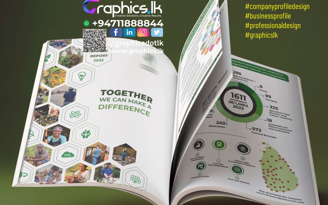
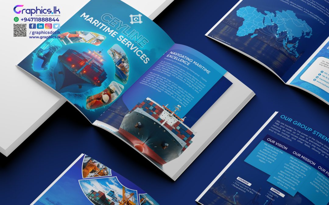
Company Profile Design: Why It Matters for Brand Credibility and Business Growth
A company profile is one of the most important brand communication tools a business can have. Whether it is used for client presentations, corporate pitches, tenders, or digital platforms, a professionally designed company profile plays a key role in shaping first impressions and building trust.
In today’s competitive business environment, company profile design is no longer just about visual appeal. It is about clarity, positioning, and credibility.
What Is Company Profile Design?
Company profile design is the strategic process of presenting a business’s identity, services, values, and achievements in a structured and visually cohesive format. It combines content, layout, typography, color, and imagery to communicate who the company is and what it stands for.
A well-designed company profile clearly answers three questions:
Why Company Profile Design Is Important
A company profile often serves as the first interaction a potential client or partner has with your brand. Poor design or unclear messaging can immediately reduce confidence, while a strong, professional profile builds credibility from the first glance.
Key benefits of a well-designed company profile:
-
Enhances brand professionalism
-
Builds trust and credibility
-
Communicates expertise clearly
-
Supports sales, marketing, and partnerships
-
Strengthens brand positioning
Designing for Clarity and Impact
Effective company profile design prioritizes clarity over complexity. Overloading a profile with excessive text or visuals can confuse readers and dilute key messages. Clean layouts, structured sections, and well-defined hierarchy allow readers to scan and understand content quickly.
Minimal, well-balanced design often communicates maturity and confidence—qualities decision-makers look for when choosing a business partner.
The Role of Visual Identity in Company Profiles
Visual identity is a critical component of company profile design. Colors, typography, and layout should reflect the brand’s personality and industry positioning. Corporate brands benefit from clean, modern, and structured designs, while creative brands can express innovation through subtle visual elements.
Consistency across the profile reinforces brand recognition and creates a professional, cohesive impression.
Content Strategy for an Effective Company Profile
Strong design must be supported by strong content. Company profile content should be:
-
Concise and purposeful
-
Aligned with brand tone and values
-
Focused on benefits, not just services
-
Easy to read and well-structured
Instead of listing everything the company does, an effective profile highlights core strengths and key projects that best represent the brand’s expertise.
Company Profile Design for Business Growth
A professionally designed company profile is not just a marketing document—it is a strategic business asset. It supports growth by:
-
Improving client confidence during sales discussions
-
Strengthening corporate presentations and proposals
-
Enhancing credibility in tenders and partnerships
-
Providing a foundation for website and digital content
When designed correctly, a company profile can be adapted across multiple platforms while maintaining consistent brand messaging.
Choosing the Right Company Profile Design Approach
Successful company profile design balances creativity with structure. It should be visually engaging but never distract from the message. Design elements must support communication, not overpower it.
Businesses that invest in professional company profile design position themselves as reliable, capable, and future-ready.
Conclusion
Company profile design is a critical element of brand communication. It influences perception, builds trust, and supports long-term business relationships. By focusing on strategic design, clear content, and consistent visual identity, businesses can create company profiles that not only look professional but also drive real business value.
In a world where first impressions matter, a well-designed company profile is not optional—it is essential.
by [email protected] | Oct 30, 2025 | Blog, Graphic Design
Why a Well-Designed Company Profile Is the Key to Building Trust and Winning Clients
In today’s competitive business world, your company profile is often the first impression your brand makes on potential clients, investors, and partners. It’s more than just a few pages of information — it’s the visual and emotional representation of who you are, what you do, and why you matter.
At Graphics.lk, we specialize in creating custom company profiles that go beyond design — they tell your brand’s story with clarity, confidence, and creativity.
🌟 What Is a Company Profile?
A company profile is a professionally designed document that highlights your business identity, values, achievements, and offerings. It serves as a brand introduction and a marketing tool that communicates your credibility to the world.
Whether printed or digital, a great company profile reflects your brand tone, aligns with your visual identity, and leaves a lasting impression.
🎨 Why Design Matters
Design plays a powerful role in how your brand is perceived.
A cluttered or outdated layout can make even the strongest company look unprofessional. On the other hand, a clean, modern, and visually balanced design instantly builds trust.
At Graphics.lk, our creative team focuses on:
• ✏️ Crafting layouts that align with your brand identity
• 🎯 Structuring content for readability and flow
• 🌈 Using colors, typography, and visuals that reinforce your message
• 💡 Maintaining consistency across print and digital formats
📘 What We Include in a Professional Company Profile
Every business is unique — and so is every profile we design.
A standard Graphics.lk company profile includes:
• Company overview and background
• Vision, mission, and values
• Products and services
• Team and leadership details
• Milestones and achievements
• Client portfolio or case studies
• Contact information and brand visuals
Each section is carefully designed to reflect credibility, consistency, and professional storytelling.
🚀 Why Choose Graphics.lk
With years of experience in branding and design, our approach combines strategic thinking and creative excellence. We’ve crafted profiles for startups, corporates, government bodies, and international brands — each tailored to match their unique goals.
When you work with Graphics.lk, you get:
✅ A dedicated creative team
✅ Personalized design concepts
✅ Print and digital-ready versions
✅ Fast turnaround without compromising quality
💬 Final Thoughts
Your company profile is not just another document — it’s your brand handshake with the world.
Let’s make it one that people remember.
📞 Talk to our design experts today: +94 71 188 8844
🌐 Visit: www.graphics.lk
📧 Email: [email protected]
#companyprofiledesign #brandidentity #corporatedesign #marketingmaterials #businessbranding #graphicslk #creativeagency #brandstorytelling
by [email protected] | Oct 28, 2025 | Blog, Graphic Design
Company Profile Design
A strong company profile is your brand’s handshake—one document for pitches, tenders, investors, trade fairs, and your website. Keep it clear, proof-driven, and on-brand. Use the checklist at the end to finish fast.
⸻
Why a Company Profile Matters
A well-made company profile:
• builds instant credibility in the first 30–60 seconds
• unifies your message across sales, tenders, and PR
• shortens buying cycles by answering key questions up front
• becomes a reusable asset (print + PDF) for months or years
Perfect for: RFPs/tenders, investor meetings, distributor onboarding, trade shows, website downloads, cold outreach.
⸻
Recommended Structure (12–24 pages)
Use this as a flexible blueprint. Add or remove sections to fit your brand.
1. Cover & Tagline
Clean cover, logo, brand colors, 1-line value proposition.
2. At-a-Glance Summary
Who you are, what you do, who you serve, where you operate, top proof points.
3. About / Story
Origin, mission, vision, what makes you different.
4. Capabilities & Services
Service buckets with short benefit lines, not just features.
5. Industries Served
Brief bullets; highlight domain expertise.
6. Case Studies (2–4)
Problem → Solution → Outcome (metrics if possible).
7. Key Numbers & Milestones
Revenue-safe metrics, timelines, scale, reach, uptime, SLAs, certifications.
8. Clients & Testimonials
Logos with permission, short quotes with names/titles.
9. Team / Leadership
Show real people; 1–2 lines on credibility.
10. Process & Quality
How you work (steps, tools, standards, QA, security, compliance).
11. Sustainability / CSR (optional)
Policies, impact, audits.
12. Awards & Certifications (optional)
Only what matters to buyers.
13. Contact & Next Steps
Phone, email, WhatsApp, website, QR to a meeting link; clear CTA.
Deliverables: print-ready file + web-optimized PDF. Keep a source file for future updates.
⸻
Writing & Design Principles that Convert
• Lead with outcomes. Turn features into benefits (“24/7 monitoring → zero downtime for your store”).
• One idea per page. Use short paragraphs, subheads, and bullets.
• Consistent hierarchy. H1/H2/H3 styles, 2-font max, generous spacing.
• Visual proof. Infographics, charts, process diagrams, icons; avoid heavy jargon.
• Brand consistency. Colors, imagery, tone; align with your brand guidelines.
• Accessibility. Font size 10–12pt for print, 14–16px equivalent for PDF; strong contrast.
• Localize smartly. If you sell across regions, plan for Sinhala/Tamil/English or other languages.
⸻
What Proof to Include (Even If You’re New)
• Quantifiable metrics: projects delivered, clients served, uptime %, average turnaround time, CSAT/NPS.
• Before/After snapshots: what changed for the client.
• Named testimonials: include role/company where possible.
• Lightweight certifications/affiliations: only those buyers value.
No sensitive financials needed—buyers want reliability signals more than revenue figures.
⸻
Our Process (End-to-End)
1. Discovery call: goals, audience, use cases, page count.
2. Outline & content map: we propose sections and flow.
3. Copy polish: benefit-led headlines, tight paragraphs, proof points.
4. Design concept: 2–3 cover directions + an inner page style.
5. Full build: layout, icons, infographics, image curation.
6. Review rounds: structured revisions with tracked feedback.
7. Final exports: print-ready + web-optimized PDFs, source files.
⸻
Common Mistakes (and Easy Fixes)
• Trying to say everything → Prioritize top 3 buyer questions per section.
• Wall of text → Break into bullets, add subheads and visuals.
• Inconsistent voice → Choose a tone (professional, friendly, premium) and stick to it.
• Generic claims → Replace with specific outcomes and micro-metrics.
• Heavy file size → Optimize images, export a 3–8 MB web PDF.
⸻
Sample Page Plan (Keeps You on Track)
• 12 pages: Cover · Summary · About · Services · Industries · Case Study ×2 · Numbers · Clients/Testimonials · Process · Contact
• 16–20 pages: Add more case studies, team, CSR, awards, FAQ
⸻
Quick FAQ
Q: How long should a company profile be?
A: Most B2B profiles work well at 12–24 pages—enough to prove value without overwhelming.
Q: Can we use the same profile for print and email?
A: Yes. We export a print-ready file and a lighter web PDF with clickable links.
Q: Can you help with copywriting and data visuals?
A: Absolutely—content, design, and infographics are included.
Q: Do you handle multiple languages?
A: Yes. Sinhala/Tamil/English or other languages on request.
⸻
The 15-Point Final Checklist
• clear value proposition on page 1
• buyer-centric headlines (benefits, not buzzwords)
• crisp section flow (one idea per page)
• 2–4 case studies with outcomes
• credible numbers and timelines
• named testimonials / recognizable logos
• consistent typography and spacing
• branded icon set and infographics
• high-quality images (licensed or original)
• contact details and a direct CTA
• print-ready & web-optimized exports
• clickable links in the PDF
• accessible contrast and font sizes
• proofread by a fresh pair of eyes
• file size under 8 MB for easy sharing
⸻
Ready to Elevate Your First Impression?
We design company profiles that win trust, open doors, and look world-class—print and PDF.
Call/WhatsApp: +94 71 188 8844 · Website: graphics.lk
Company Profiles – https://graphics.lk/project_category/company-profiles/
Book and Magazine – https://graphics.lk/project_category/book-and-magazine/
by [email protected] | Oct 26, 2025 | Graphic Design
Your label is a promise. Your packaging is the experience. At Graphics.lk, we craft both—clear, compliant, and beautiful.
What you get: strategy boards, range systems, premium finishes, color proofing, and seamless handover to your printer. Launching a new SKU or rebranding an entire line? Let’s make it unforgettable.
Message us with your product and market (local/export) for a free mini-consult.
#graphicslk #packagingdesign #labeldesign #productlaunch #retaildesign #premiumpackaging #printdesign #madeinsrilanka